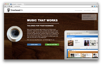
Today, Overhead.fm is unveiling entirely new branding and look and feel. We worked with the excellent Stephen Hernandez on the design. We gave Stephen a challenge: our branding needed to be simple and cutting edge while still being professional and business-friendly. We think Stephen’s design strikes this balance perfectly, and the end result is striking.
Screenshots take front-seat, immediately showing how Overhead.fm works for businesses. Subtle parralax scrolling effects call attention to the most important content, and the whole site is tied together with beautiful imagery and typography.
As always, the design will change based on A/B testing and new needs, but we’re proud of Overhead.fm’s new look and feel.