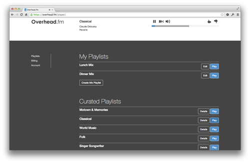
The Overhead.fm player has seen a lot of new features in the last year, and the player design has accomodated these additions admirably. Still, we’ve worried that some of the simplicity and elegance of the orignal Overhead.fm design has been lost in the pursuit of adding new features.
To make sure that Overhead.fm remains simple to use, we embarked on a project to complete redesign our webapp. Today, we’re giving subscribers a sneak peek into what we’ve been working on. To see the new version, simply opt in using the new banner at the top the player - you can always switch back.
The new interface radically simplifies things: it provides easy access to the most important content, your mix stations and curated playlists. It also makes updating your account or billing information seamleess.
The new webapp is designed to adapt to screensizes ranging from smartphones up to large-screen displays. This versatility is important, as we know that businesses use Overhead.fm on a wide range of devices. Perhaps most importantly, the new webapp puts us on a solid footing to continue improving the product. The new player is built modularly with a modern client-side framework that makes it easy for us to add features like building blocks. With the new Overhead.fm webapp as our foundation, we’re well positioned to keep pushing the envelope of what music for businesses can be in 2014.
Updated 12/20/2013: The new webapp is now the default interface for all users.