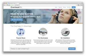
Almost a year after our last major visual refresh, we’re at it again. Over the past year, our old site saw a lot of small updates. Ultimately, though, it didn’t change as much as our product. Since the last major redesign, we launched a slew of major features, including multi-location controls and mobile apps.
While we added this information to the old site, it never felt like the best solution: our old site was clearly designed for a simpler product. With our multi-tiered product with a complex feature set, our site needed to improve usability.
Today, we’re unveiling an overhaul of our entire site. It’s cleaner, simpler, and more informative. We believe it makes it easier for current Overhead businesses and prospective users to find the information they need.
In addition to simplifying the design, we’ve added a lot of information to the site. Among other things, new customers can now see a concise list of our features for businesses, a complete list of our playlists, and a compilation of frequently asked questions.
Our new design is also more mobile friendly than our outgoing homepage. With the new design, we truly gave equal weight to mobile and desktop, reflecting the fact that many of our customers use our service on mobile devices.
Like most major changes, we’ve been a/b testing the new design for a while, so you may have already seen it. But starting today, we’re rolling out this new design for everyone.
Updated 12/10/2013: The homepage screenshot was changed to reflect the new look.